Magnolia Brings Smile on Danette Cup
The brand Danette with a smile on its package cup has drawn a boundary line between itself and other brands: A boundary line which should also have been identified by the audience so that the remaining brands could not make them confused. For this reason, the brand Danette has launched a large campaign designed and implemented by the Magnolia Advertising Company. We talked with Kouhzad Khatami, Danette brand manager and the Creativity, Strategy and Implementation team of the Danette campaign from the Magnolia Agency.
Q: Would you please explain the goals behind implementation of Danette smile campaign?
Kouhzad Khatami, Danette Brand Manager: Creating a concept in the minds of the consumers to differentiate product of the brand Danette and products resembling this brand in the market as well as beginning presentation of a new identity of the brand Danette were among other targets which were followed in the campaign in question.
Q: What trend did the campaign follow and why the brand Danette decided to change the label of its products?
Khatami: The idea of introducing the “smile symbol” as the visual/emotional symbol of the brand Danette could be called the main point of the campaign.
Also, the short time before the start of the campaign, the New Year (Nowruz) holidays, and lack of prior readiness to change the product label all led to create a gap between the time schedule for the implementation of the campaign and the planning procedure. On the other hand, increasing the distinction with the competitors on the store shelves by relying on the “smile symbol” was the main reason for changing the product label.
Q: Tell us about the feedbacks?
Khatami: About the internal feedbacks the following cases should be cited:
• The feedback from the top executives and the body of Danone Company towards this campaign as an effective solution for creating distinction with regard to other similar products was highly positive.
• The main idea of the campaign was welcomed by the director of ASPAME Area.
As for the industry feedback I should say:
- The initial feedback from industry activists on the idea of “smile” was more focused on the design of peripheral advertisement and the quality of video production.
Regarding the consumer feedback, we should also remind the following points:
• The new sticker design has been welcomed.
• The concept of video is sometimes hardly understood by the consumers.
Q: How satisfactory was the campaign for brand Danette and do you plan to continue it?
Khatami: The idea of the campaign has been achieved very innovatively and by focusing on the knowledge gained from the consumer behavior. Also, the symbol of “smile” provides an appropriate visual/emotional platform for the future activities of Danette brand. It should be noted that the potential of the idea had a significant advantage over its implementation. And the final point: planning and implementation (in the activation section) have a lot of room for improvement.
(Here, the Creativity, Strategy and Implementation team for launching Danette campaign from the Magnolia Company answer questions).
Q: In this campaign, what problems the brand Danette was faced with?
Pouya Sabbagh, Strategy Manager: The cold spoon deserts of the brand Danette has a long record in the market and awareness about the brand is very high among the audience and a high percentage of the audience is familiar with this brand and well know its products. But recently several other brands have entered the market: Brands that use the form and shape of the brand Danette packaging for presenting their products and thus confuse the audience at the time of shopping. Therefore, sometimes the consumer mistakenly buys another product instead of Danette. Solving this confusion was an issue that had been raised at the initial brief of the Danone Company in a pitch with the presence of different advertising companies: A problem for which the Magnolia Company offered a solution and won the pitch. To solve the challenge, we had to do something that created a great distinction for the brand Danette. The distinction had to be as such that the audience could easily detect and select the Danette product from among similar and copied products. The distinction we talked about was presented as a message to the audience. A message that was similar to that of the former brand Danette and within the brand passport framework. By reviewing these cases, we entered into the ideation phase.
Q: Tell us about the ideation process of brand Danette challenge?
Negar Sarkhosh, Creativity Manager: At the beginning of the ideation phase, we decided to highlight the advantages of brand Danette products and tell the audience about Danette’s history, preparation and its French identity. But this solution did not seem very attractive to us. Therefore, we went for brand Danette passport and carefully reviewed it. We were looking for a point of contact with an element that the brand had not yet contacted with the audience through it: A point of contact which was novel for the audience and would make them identity the original product from the copied product. An element which cannot be copied either. In the brand Danette passport it had been said that the brand products could give a good feeling to the consumer, and that they could well share it with others. A good feeling that a smile could be its visual symbol: A smile that was also on the brand logo and never before it had been looked at purposefully. Finding the smile solved the challenge: A smile through which we could remind the audience of the remaining advantages of brand Danette product. In fact, we have found an element that could not be copied by the competitors.
Sabbagh: In this project you cannot draw a boundary between the strategy and the creativity. The solution to the challenge had come out of the brand and a powerful message had been formed: A message for which the brand changed the label of its products. As you know, changing the label is not easy but the brand paid the price to convey its message and the product is currently available in the market with the new label. It is noteworthy to mention this point that the brief provided by the Danone team was so comprehensive and complete that easily placed the creativity team in the direction it should take. Presentation of such a brief by companies is less likely to happen.
Q: How did the idea come about?
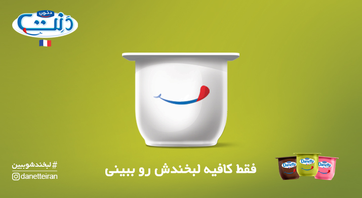
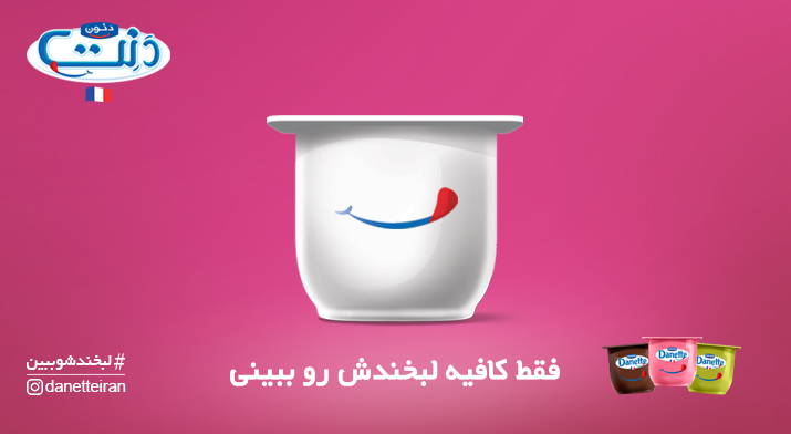
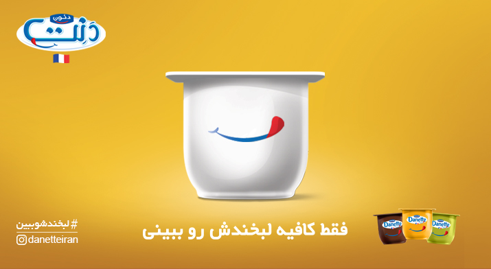
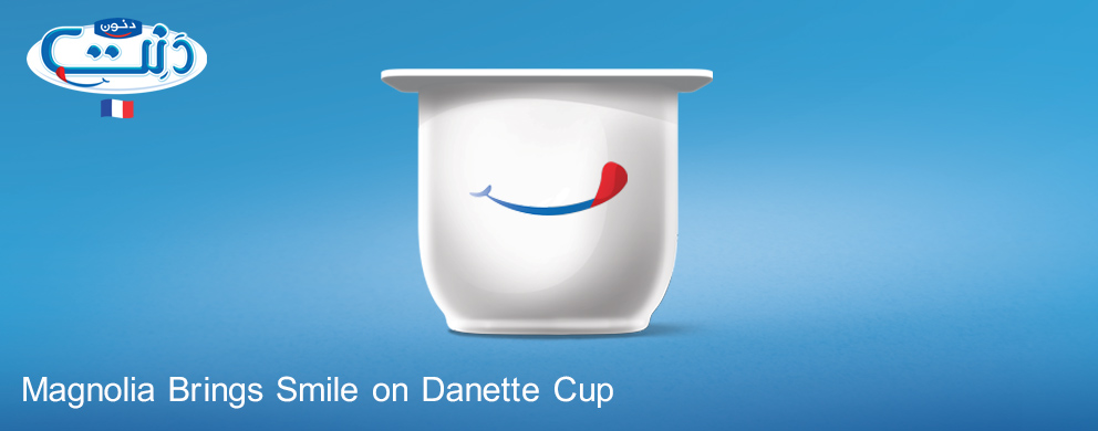
Gouya Delavari, Arts Manager: The idea was so attractive that drowned us in a short period of time, and this same issue encouraged us to gain access to other points. The package cup, the product shape and the brand reality were the elements through which we implemented the idea. The cases I mentioned were placed on the center and were turned into the main image of the campaign. Therefore, the smile and the cup of the product were the main design elements in the campaign. The smile illustrated on the cup of the product will hereinafter play the role of the brand signature: A signature no other brands could use. In addition, the variety of the products and colors allowed us to offer different designs. Therefore, in the simplest graphic shape with the contrast of the color of the cup, white, we showed the smile to the audience with the color of the flavors. Also, the French identity of the product greatly helped the design of the product. Such a trend created a new and fresh feeling in the campaign: A feeling that was created with familiar elements and reminded the audience of the sweet taste of the product: A product that had a different appearance for the audience. The created image-making resulted in the identification of the brand position in the market: A place that created a gap with other products.
Keep in mind that the product and the brand ingredients have totally made the brand Danette distinctive towards the remaining brands. The audience also often enters the shop to buy Danette deserts. If there was a mistake and the consumer took another product from the shelf instead of Danette it was because of lack of proper presentation. An element should have split the Danette product from the remaining brands so that the consumers would notice copied products.
Sarkhosh: If we focused on the advantages of the product in this campaign, the audience would compare the Danette product with the remaining brands. We did not intend to do this because the status of the products of brand Danette is so high and there was no need to compare.
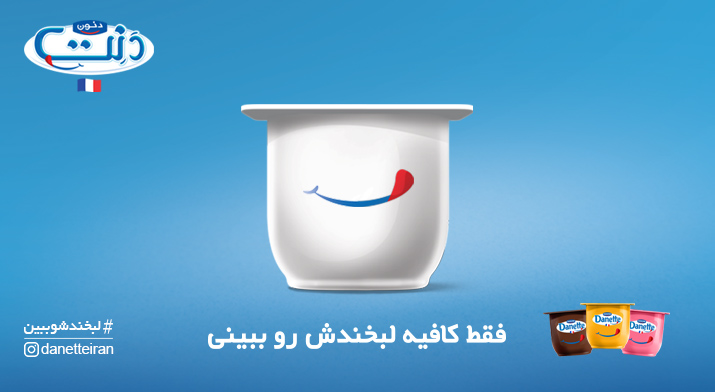
Also, the selection of colorless cup and the label with a smile has also been targeted. By doing so, we told the audience that Danette’s smile has made the audience to buy, and it is only sufficient the consumer see Danette’s smile and there is no need to look at other elements. The consumers by buying Danette would reach their goal which is a good feeling. A good feeling they have repeatedly experienced with Danette and would feel it again: A good feeling that has created a good relationship between Danette and its consumers.
In the peripheral phase of the campaign, only a colorless cup and the label with a smile and a slogan were shown to the audience. A cup that was indicative of the high confidence of the brand Danette. Such a design showed that the audience was happy with Danette and it is enough they once again see Danette’s smile. The slogan also transmitted exactly the same message to the audience: A message that says “Just enough to see the smile!”
Q: Which media did you use to deliver the campaign message to the audience?
Maryam Ayyoubi, Project Manager: The implementation phase of the campaign started as of April 6. This phase began with the screening of the billboards: Billboards that have already been talked about their design and elements. The minimal elements conveyed the message to the audience. But the message needed to be completed and, to this end, we referred to the digital media. Of course, prior to the screening of the billboards, the group had engaged the minds of the audience in the digital media by presenting designs for the cup of the product together with the smile. In the designs plans we just asked a question and did not provide the answer to the audience. These designs were released shortly prior to the billboards. At that time, we received a lot of good feedbacks from the audience. At the same time, design for the label was also made and the Danone Company decided to change. Changing the label was a big deal that the power of the idea had caused, and with regard to the feedbacks, Danette’s executives were happy with it. I should also mention this point that an interesting video was designed for the digital media. In this video, we precisely scrutinized the issue for the audience and informed them of the campaign and the new measure of Danette. The video was watched significantly.
Q: Was sampling done for the campaign?
Ayyoubi: Yes, we used several sites for sampling in different parts of Tehran. The sampling program was performed in the middle of the month Shaban in the presence of a number of promoters who presented the product to the audience with a smile. A documentary video was also prepared of the program which will be released shortly. The welcome accorded to this program was also interesting. In this sampling, a new product was not presented to the audience, only they were reminded that Danette, with its usual smile, is waiting for them.
Sabbagh: Danette has targeted a wide range of audience. Therefore, in the sampling, we visited all districts of Tehran to cover so many groups. In the program, dresses of promoters and … were all designed with Danette’s smile. In the prepared video too the smiles of the audience and Danette have been showed. In fact, all the advertising media repeatedly show Danette’s smile to the audience.
Q: Would you please explain about the Super Zoom Quiz?
Sarkhosh: We started with the video in the digital media, especially the Instagram: A video which showed the products on the shelves to the audience. Along with the video, other media also repeated the smile for the audiences. Now it was the time to engage the audience. At this point, we asked them to buy the product and as soon as they see the smile they take a story of it by the Instagram Super Zoom and release it with the hashtag # see its smile and by mentioning Danette’s page. Next to the competition, different posts were released with the presence of the product. In these posts, we reminded the audience of Danette’s difference from other brands.
Sabbagh: The interesting point about the competition was that the audience was not supposed to show the product in an artificial and unrealistic way in their images. They used the Instagram template and played somehow and finally received prizes.
Q: Tell us about the companionship of the influencers?
Sarkhosh: Influencers also told the audience of Danette’s smile. Of course, they indirectly referred to the copying of other brands. They told the audience in their own language, not to be mistaken and chose the original product with a smile. They produced a variety of videos for which scenarios proper to the character and the type of activities of the influencers had been prepared. At the end of the videos, the Danette smile aggravated and the match was introduced to the audience. The videos were released again in the brand Danette page.
Q: Tell us about the continuity of designs of different promotional media.
Delavari: All the designs are linked with the element of smile. In the peripheral design, a simple message was transmitted to the audience but in the digital media, we had the opportunity to show the products and their other advantages to the audience. In the digital media, it was not just the product to play with and an interesting space was created. We face fewer restrictions in the digital media. Therefore, we used the color and the product abundantly.
Q: And the final point?
Sabbagh: We always believe that the strategy and the message designed for the brand should be so deep that they can be used in the long run: The time that would gradually show the main purpose of the designed strategy to the audience. Danette’s smile will not be detached and has prepared a lasting ground for the brand. We hope that we will launch the campaign from other angles.
Delavari: The campaign was carried out properly from all aspects and there is no complaint. In fact, it can be said a proper format was designed and implemented for the campaign.
Sarkhosh: We are thankful of the team of Danone Company because, their detailed and specialized look at the subject resulted in the sound implementation of the campaign.
Ayyoubi: The empathy and teamwork of the creativity and implementation team as well as the team of the Danone Company led to the creation of such an idea and campaign: A campaign that made all of us feel good.
